Cart
0

Table of Contents
- Start With a Neutral Base Color Palette
- Build Your Interior Design Color Palette Tips for Accent Colors
- How to Mix Decor Styles Without Clashing
- Use Texture and Natural Materials for Depth
- Create a Home Decor Mood Board to Guide Your Choices
- Establish Visual Flow Between Adjacent Rooms
- Budget-Conscious Cohesion for Renters and Small Spaces
- Conclusion
Last Updated: August 21, 2026
Start With a Neutral Base Color Palette
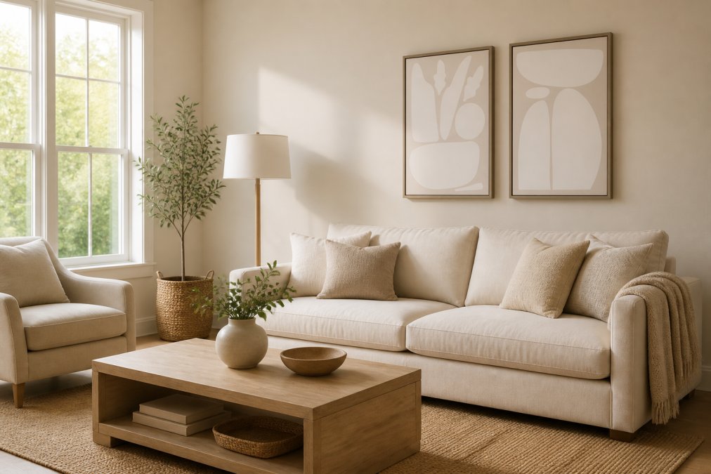
A neutral base color palette creates the visual foundation that allows every other design choice to work together seamlessly. Neutral tones like beige, cream, soft gray, and warm white establish spatial continuity across rooms and make spaces feel larger and more cohesive.
Why neutrals create visual flow
Neutrals work because they don't compete for attention. A cream wall doesn't clash with a beige throw blanket. This restraint is where cohesion begins. When adjacent rooms share a similar neutral undertone, you create spatial continuity, the eye moves naturally from one room to the next without jarring color shifts.
The key is consistency in undertone. A warm cream paired with a cool gray can feel mismatched, even though both are neutral. Your neutral base should favor either warm or cool tones throughout the home, creating harmony at a subtle level most people feel without consciously noticing.
Choosing undertones that work across rooms
Undertones are the hidden colors beneath a paint color or material's surface (the FDA). A "white" might lean warm (toward cream), cool (toward icy), or slightly pink. When building cohesive home decor across multiple rooms, undertone consistency matters more than the actual color name.
Test your neutrals in different rooms and lighting conditions. Bring paint samples or fabric swatches home and observe them at different times of day. Pick one neutral as your dominant base color, then select 2-3 supporting neutrals with the same undertone family. This creates a monochromatic foundation that feels intentional.
Build Your Interior Design Color Palette: Tips for Accent Colors
Once your neutral base is solid, accent colors add personality and depth. Accent colors are where you introduce jewel tones, warm terracottas, soft sage greens, or muted blues that reflect your taste.

The 60-30-10 rule for balanced color distribution
The 60-30-10 rule is a time-tested framework for distributing color in any space (peer-reviewed research). Sixty percent should be your dominant neutral base. Thirty percent should be a secondary color. Ten percent should be your accent color, the pop that draws the eye and creates visual interest.
This ratio prevents accent colors from overwhelming a space. If you love a deep navy blue, use it on 10% of your room, perhaps a statement chair or artwork. The remaining 90% is neutral and secondary colors, letting that navy feel intentional rather than oppressive.
When selecting complementary hues, consider color undertones. A warm terracotta accent pairs naturally with warm neutrals. A cool teal accent works best with cool grays and whites. Mixing warm and cool accents is possible but requires intention.
How to Mix Decor Styles Without Clashing
Mixing styles, mid-century modern with farmhouse accents or industrial with bohemian textures, is possible when you identify common threads running through your favorite pieces and build around those threads.
Balancing wood tones and metal finishes
Wood tones and metal finishes are foundational style indicators. Choose 2-3 dominant wood tones and 1-2 metal finishes, then stick to them. Light wood with brushed nickel. Dark walnut with brass. Natural oak with matte black. This constraint is liberating, you can choose pieces based on what you genuinely love, knowing they'll work together because the materials align.
A mid-century modern chair in walnut with brass legs sits comfortably next to a farmhouse table in the same wood tone, even though the styles aren't identical. The shared materials create visual continuity.
Maintaining consistency across transitional spaces
Transitional spaces, hallways, entryways, stairwells, are where cohesion either holds or breaks down. Use them as visual bridges. A hallway painted in your dominant neutral with artwork echoing accent colors from adjacent rooms guides the eye smoothly from one space to the next. An entryway console table in your chosen wood tone, styled with accessories referencing colors from nearby rooms, creates spatial continuity.
Use Texture and Natural Materials for Depth
Texture prevents a neutral room from feeling flat or sterile. Without it, even a well-chosen color palette can feel cold. Texture adds visual interest and depth that keeps a space from feeling one-dimensional.
Layering stone, ceramics, and woven elements
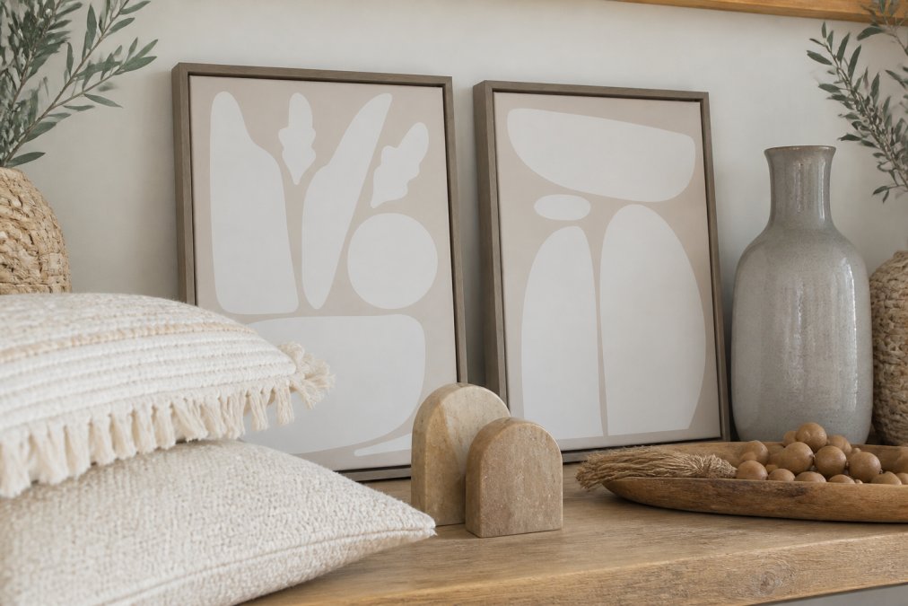
Natural materials, stone, ceramics, wood, and woven fibers, create a harmonious atmosphere (peer-reviewed research). Stone brings weight and permanence. Ceramics add warmth and handmade character. Woven elements introduce organic texture that softens hard surfaces.
Balance is key. Too much texture becomes visually chaotic; too little feels sterile. Aim for a mix: smooth ceramic next to rough woven fiber, cool stone next to warm wood. Choose 3-4 natural materials that appeal to you, then repeat them throughout your home. A ceramic vase on a shelf, ceramic tiles in a kitchen, ceramic planters in a bedroom, material consistency creates cohesion even though the objects serve different purposes.
Create a Home Decor Mood Board to Guide Your Choices
A mood board forces you to test combinations before spending money and gives you a visual reference when shopping or decorating.
Curating pieces you genuinely love
Start by gathering images of rooms, pieces, colors, and textures you're drawn to. After collecting 20-30 images, look for patterns. What colors appear repeatedly? What materials show up across different rooms? These patterns reveal your authentic design preferences.
Curate your mood board down to 10-15 images representing your ideal aesthetic. Include color swatches, material samples, and actual pieces you're considering. This becomes your shopping guide and decision-making filter.
Testing combinations before purchasing
Before committing to a major purchase, test how new pieces work with what you already own. Print or save an image of a statement chair and add it to your mood board alongside photos of your existing furniture. Does the color work? Do the materials feel cohesive?
For AllWayzHome's curated collections, use your mood board to verify that the colors, materials, and styles in a bundle align with your home's existing foundation before purchasing.
Establish Visual Flow Between Adjacent Rooms
Visual flow makes a home feel cohesive rather than like a collection of disconnected rooms.
Creating spatial continuity with repeating elements
Repeating elements create visual flow without making every room identical. A color that appears as an accent in one room might be the secondary color in the next. A material used for a shelf in one room might reappear as a frame or planter in another.
These repetitions don't need to be obvious. A throw pillow in a specific color in the living room, a framed print in that same color in the hallway, and a ceramic piece in that color in the bedroom create subtle continuity. Lighting also contributes, consistent lighting temperature across rooms creates a unified atmosphere.
Budget-Conscious Cohesion for Renters and Small Spaces
Cohesive home decor doesn't require significant spending. Start by investing in foundational pieces: a neutral sofa, a good area rug, and basic window treatments. These larger items set the tone and create the 60% of your color palette. Build around them with smaller, less expensive pieces like throw pillows, wall art, and plants.
For renters, avoid permanent changes. Use removable wallpaper, large artwork, or fabric to establish your color palette. Peel-and-stick tiles can transform a backsplash without commitment. Small spaces benefit from the same principles, just applied more rigorously.
AllWayzHome's curated bundles work particularly well for renters and budget-conscious decorators. Rather than piecing together items from multiple sources, bundles combine complementary pieces at a fixed price point, removing guesswork and often costing less than buying individually.
| Budget Strategy | Investment Level | Best For | Expected Lifespan |
|---|---|---|---|
| Foundational investment | High (sofa, rug, window treatments) | Creating a lasting base | 5+ years |
| Seasonal swaps | Low (pillows, throws, small decor) | Adding personality without commitment | 1-2 seasons |
| Curated bundles | Medium (coordinated collections) | Renters and quick refreshes | 2-3 years |
| Thrifted and DIY | Variable (depends on sourcing) | Budget-conscious decorators | Varies |
Cohesive home decor results from intentional choices guided by a clear framework. Start with a neutral base, add complementary accents, layer in texture, and test combinations before purchasing. AllWayzHome's curated collections simplify this process by bundling pre-coordinated pieces that work together, saving you time and reducing the risk of mismatched purchases. Whether you're refreshing a rental or creating your forever home, these principles apply. Explore AllWayzHome's thoughtfully designed bundles and discover how the right pieces transform a house into a warm, inviting sanctuary that feels authentically yours.
Frequently Asked Questions
What is the 60-30-10 rule in interior design?
The 60-30-10 rule is a proven formula for cohesive home decor. Use your dominant neutral color (like beige or gray) for 60% of your space, walls, large furniture, flooring. Apply a secondary color for 30% through accent walls, larger decor pieces, or textiles. Reserve the final 10% for bold accent colors in art, pillows, or accessories. This creates visual balance and ensures your cohesive home decor pieces work together without overwhelming the space.
How do I choose a color palette for my entire home?
Start by selecting 2-3 neutral base colors that will flow across all rooms. Consider undertones: warm neutrals (cream, warm gray, taupe) pair differently than cool neutrals (greige, cool gray, soft white). Then choose 1-2 complementary hues for accents. Walk through your home with paint samples and fabric swatches to see how they interact across different lighting. A home decor mood board helps you visualize whether pieces will feel cohesive before purchasing.
Can I use different wood tones and metal finishes in the same room?
Yes, mixing wood tones and metal finishes is a key part of how to mix decor styles without looking chaotic. The trick is limiting your palette: stick to two wood tones maximum (like warm oak and cool walnut) and two metal finishes (such as brushed gold and matte black). Repeat these combinations throughout the room to create cohesion. Neutral walls and consistent accent colors tie mixed finishes together and prevent the space from feeling disjointed.
What if I'm renting or moving soon, are cohesive home decor pieces worth the investment?
Absolutely. Cohesive pieces are actually ideal for renters because they're typically portable and flexible. Focus on removable decor like wall art, pillows, plants, and textiles that travel with you. AllWayzHome's curated collections, like the Sylvie framed canvas sets ($109.99-$164.99), work across different spaces and styles, making them smart investments for anyone who moves. Quality, timeless pieces maintain their appeal and function in multiple homes, so you're not wasting money on temporary aesthetics.
This article was written using GrandRanker