Cart
0
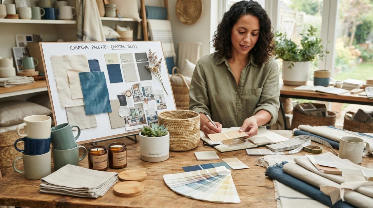
Table of Contents
- Understanding Cohesive Home Decor Color Palette Ideas
- The 60-30-10 Rule: Your Foundation for Color Balance
- Building Your Whole House Color Palette
- Warm vs Cool Color Palettes Home Decor: Which Works for You
- How to Choose Paint Colors for Open Concept Living
- Using Color Palette Generators and Tools for Home Decor
- Practical Steps to Test and Implement Your Palette
- Budget-Friendly Ways to Implement Your Cohesive Color Palette
Last Updated: July 29, 2026
Understanding Cohesive Home Decor Color Palette Ideas
Creating cohesive home decor color palette ideas is one of the most transformative yet misunderstood aspects of interior design. At AllWayzHome, we've observed that homeowners often struggle not because they lack taste, but because they approach color selection without a strategic framework. When you establish a unified color story across your living spaces, your entire home feels intentional, spacious, and harmonious. A cohesive approach means every hue, whether dominant, secondary, or accent, serves a purpose in your overall design narrative. Research from American Society of Interior Designers emphasizes that color harmony significantly impacts how we perceive space, mood, and comfort levels in our homes.
In 2026, more people are investing time in home personalization as remote work keeps us inside longer. A well-planned color palette doesn't just look better; it reduces visual fatigue and makes decorating decisions faster and cheaper.
Pro Tip
The single biggest mistake homeowners make is treating each room as an isolated design project. Instead, think of your entire home as one continuous canvas where colors transition thoughtfully rather than clash.
The 60-30-10 Rule: Your Foundation for Color Balance
The 60-30-10 rule gives you a proven formula for color distribution that works across nearly every design aesthetic. This principle allocates 60% of your space to a dominant color, 30% to a secondary color, and 10% to accent colors. Your dominant color typically appears on walls, large furniture pieces, or flooring and should be a color you can live with long-term, think warm neutrals like beige, soft gray, or pale cream. Secondary colors (30%) appear in medium-sized elements like sofas, area rugs, or cabinetry, adding depth without flatness. Accent colors (10%) are where personality emerges through throw pillows, artwork, plants, or decorative accessories in bolder hues.
When applied across your whole house, the 60-30-10 rule creates visual flow. Your dominant color might shift slightly between rooms (warm beige in the living room, soft gray in the bedroom), but keeping it within the same family prevents jarring transitions. Secondary and accent colors can repeat strategically throughout your home, creating threads that tie spaces together.
Key Takeaway
The 60-30-10 rule isn't rigid, it's a starting point. The concept matters more than exact percentages: most of your space should feel calm and consistent, with secondary colors adding interest and accents providing visual punctuation.
Building Your Whole House Color Palette
Selecting Your Dominant Color
Your dominant color will occupy approximately 60% of your visual environment, so it needs to work across multiple rooms and feel timeless. Most design professionals recommend selecting a neutral as your dominant color, soft grays, warm beiges, creamy whites, or muted taupes all provide excellent foundations that allow secondary and accent colors to stand out. Neutrals adapt to changing light throughout the day and across seasons, and they provide a stable backdrop that won't overwhelm accessories, textiles, or artwork you add later.
Consider your home's natural light when selecting your dominant neutral. North-facing rooms tend to feel cooler, so warm-toned neutrals (beiges with yellow or red undertones) prevent coldness. South-facing spaces receive intense light, so cooler neutrals (grays with blue undertones) help balance brightness. Test your chosen dominant color in actual paint samples across different times of day before committing.
Choosing Secondary and Accent Colors
Secondary colors create depth and prevent your space from feeling one-note. These colors occupy roughly 30% of your visual space and typically appear in larger pieces like sofas, area rugs, curtains, or painted accent walls. Choose secondary colors that either complement or harmonize with your dominant color. Complementary colors sit opposite each other on the color wheel (like warm beige with soft teal), while analogous colors sit beside each other (like beige with warm gray).
Accent colors inject personality and visual interest through roughly 10% of your space via throw pillows, artwork, plants, or decorative objects. Deep jewel tones, warm terracottas, or rich forest greens work well. The key to harmony is limiting your accent colors to 2-3 options that repeat throughout your home. If your living room features coral accents and your bedroom features navy, your kitchen might combine both in artwork or accessories, creating visual continuity.
Watch Out
A common mistake is choosing too many accent colors. Each new bold hue competes for attention, making your space feel chaotic rather than curated. Stick to 2-3 accent colors maximum across your entire home.
Warm vs Cool Color Palettes Home Decor: Which Works for You
Warm palettes include colors with red, orange, or yellow undertones, terracotta, warm gray, golden yellow, or rust, creating intimate, energizing environments. Cool palettes feature colors with blue, green, or purple undertones, soft blues, cool grays, sage green, or lavender, feeling calm, spacious, and sophisticated. Neither is inherently better; the right choice depends on your lifestyle, natural light, and how you want each room to function.
The real strategy is consistency. Mixing warm and cool tones throughout your home creates visual tension that feels disjointed. Instead, choose whether your whole house color palette leans warm or cool, then vary saturation and lightness within that family. If you have open-concept living, this becomes even more critical. When your kitchen flows directly into your living room, using both warm and cool tones creates visual confusion.
How to Choose Paint Colors for Open Concept Living
Creating Visual Flow Without Hard Walls
Open-concept homes require subtle color transitions rather than dramatic shifts. Instead of painting your kitchen a warm beige and your living room a cool gray, choose two variations within the same color family. Your kitchen might be warm beige, while your living room is warm taupe, different enough to feel intentional, similar enough to flow seamlessly.
Furniture placement and textiles do much of the heavy lifting. A large area rug in your living room defines that space through color and texture, while kitchen bar stools in a coordinating hue bridge the two areas. Lighting also plays a crucial role; pendant lights over a kitchen island, table lamps in a living room, and overhead fixtures create visual separation through illumination while reinforcing your overall cohesion.
Using Color Palette Generators and Tools for Home Decor
Digital tools have made creating cohesive color palettes far more accessible. Color palette generators allow you to input a favorite color and receive complementary or analogous options instantly. Tools like Coolors color palette generator let you explore thousands of combinations and adjust saturation and brightness to match your vision. Pinterest and design platforms offer another approach: collect images of spaces you love, then use a color picker tool to extract exact hues.
However, digital tools have a limitation: they don't account for how light behaves in your specific home. A color that looks perfect on your monitor might feel entirely different on your walls. Use generators and tools to narrow your options to 3-5 possibilities, then test those in your actual space.
Pro Tip
Save color palettes you create in design apps by taking screenshots or exporting them as images. When shopping for textiles, paint, or accessories, you can reference your exact palette rather than relying on memory.
Practical Steps to Test and Implement Your Palette
Testing Paint Swatches in Real Light
The most critical step in implementing your cohesive home decor color palette is testing paint swatches in your actual space. Paint manufacturers like Benjamin Moore and Sherwin-Williams offer sample sizes for this purpose. Purchase 2-3 quart samples of your top color choices, paint large swatches (at least 2 feet square) on different walls, and observe them throughout a full day and evening.
Pay attention to how light changes your perception. Morning light, afternoon light, and artificial evening light all shift how colors appear. If your room receives limited natural light, test your swatches under the exact lighting conditions you'll use most. Also test swatches on walls with different exposures, as a north-facing wall will make colors appear cooler, while a south-facing wall intensifies warmth.
| Test Element | Duration | Frequency | What to Notice |
|---|---|---|---|
| Morning light | 1-2 hours | Daily for 3 days | Does the color feel warm or cool? Does it look different than evening? |
| Afternoon light | 2-3 hours | Daily for 3 days | Does saturation increase or decrease? How does it compare to morning? |
| Evening light | 3+ hours | Nightly for 3 days | How do artificial lights interact with the color? Does it feel inviting or harsh? |
| Adjacent colors | Ongoing | Throughout testing | How does the swatch look next to your existing furniture and textiles? |
Coordinating Textiles, Décor, and Accessories
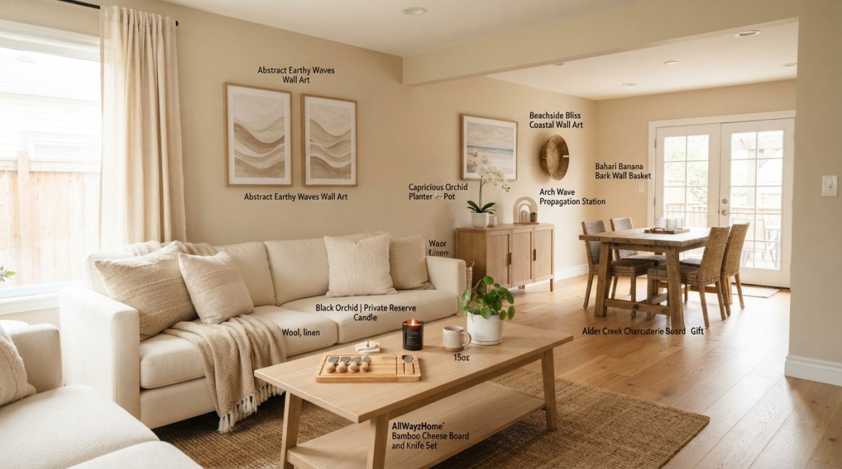
Once you've committed to your paint colors, coordinate textiles, décor, and accessories that reinforce your cohesive color palette. Textiles, curtains, rugs, throw blankets, and upholstery, are where secondary and accent colors truly come alive. Treat textiles as part of your overall palette rather than afterthoughts. When shopping for a sofa, choose fabric in one of your secondary colors. If your palette features warm beige walls and terracotta accents, a sofa in warm taupe or soft rust directly supports your vision.
AllWayzHome offers curated collections designed to work together harmoniously. Products like the [Abstract Earthy Waves Wall Art](https://allwayzhome.myshopify.com/products/abstract-earthy-waves-wall-art) ($69.99) feature warm, neutral tones that complement most palettes, while the Midnight Ombre Hand-Felted Wool Ukhamba Bowl ($94.00) adds depth through texture and subtle color variation. When selecting accessories, use the 60-30-10 rule as your guide. Most pieces should echo your dominant or secondary colors, while a smaller percentage introduce accent hues.
Budget-Friendly Ways to Implement Your Cohesive Color Palette
Building a cohesive color palette doesn't require a complete home overhaul or large budget. Strategic, phased implementation allows you to develop your vision gradually while spreading costs across months or years. Start with paint, which offers the highest visual impact for the lowest cost. A gallon of quality paint typically costs $30-50 and can transform an entire room.
Thrift stores and secondhand marketplaces offer incredible opportunities to find textiles, artwork, and accessories in your chosen palette at a fraction of retail prices. Repurposing what you already own is another powerful strategy. A throw blanket you love might not match your new palette perfectly, but layering it with coordinating pillows and accessories makes it feel intentional. DIY projects, painting a bookshelf in your secondary color, stenciling a pattern in your accent color on a plain rug, or creating a gallery wall with affordable frames, cost significantly less than buying finished pieces.
The most budget-friendly approach is patience. Rather than buying everything at once, implement your palette gradually. This phased approach prevents costly mistakes and spreads financial burden across time.
Key Takeaway
The most expensive palettes aren't those with bold colors or premium materials, they're those implemented without a plan. Investing time upfront to define your cohesive home decor color palette prevents costly mistakes and ensures every purchase supports your vision.
Creating a cohesive home decor color palette transforms how your entire home feels and functions. The challenge most homeowners face isn't lack of taste, it's lack of strategy. AllWayzHome makes this process easier by offering thoughtfully curated collections designed to work together harmoniously. Whether you're starting fresh or refreshing existing spaces, our selection of wall art, decorative accessories, and textiles in coordinated colors helps you implement your vision without guesswork. Explore More and discover how intentional color choices create the warm, inviting sanctuary you deserve.
Frequently Asked Questions
How do I create a cohesive color palette for my home using the 60-30-10 rule?
The 60-30-10 rule divides your color palette into three parts: 60% dominant color (typically a neutral), 30% secondary color, and 10% accent color. Start by choosing a neutral base for walls and large furniture pieces. Add your secondary color through textiles like curtains and rugs. Finally, introduce your 10% accent color through artwork, throw pillows, or decorative accessories. This mathematical approach ensures visual balance and cohesion throughout your space without overwhelming the senses.
What's the best way to use a color palette generator for home decor planning?
Digital color palette generators let you input a base color or upload an image, then generate harmonious color combinations instantly. Start with a color you love, perhaps from artwork or a treasured textile, and input it into a free generator. Review the generated options and note undertones and saturation levels. Test how these palettes look in your actual spaces under different lighting conditions. Use the generator results as a starting point rather than a rigid rule, adjusting based on your natural light and personal preferences.
How do I choose paint colors for open concept living that create visual flow?
In open concept spaces, use the same or closely related neutral undertones across all visible walls to create seamless visual flow. Choose one dominant neutral base and carry it through the space, then subtly shift secondary colors between zones using textiles, rugs, and furniture rather than paint. This approach maintains cohesion while allowing distinct areas to feel separate. Consider how natural light moves through your space throughout the day, as lighting temperature affects how colors appear and whether your palette feels warm or cool.
What are some budget-friendly ways to implement a cohesive color palette without repainting everything?
Paint is just one tool. Layer your color palette through affordable textiles like throw pillows, blankets, and kitchen towels, items like the Verona Waffle Kitchen Towels ($16.95) in neutral tones provide functional decor. Use wall art strategically: pieces like the Abstract Earthy Waves Wall Art ($69.99) or Sylvie Zen Botanical Canvas Set ($109.99) introduce color without commitment. Add accent pieces through plants, decorative bowls like the Midnight Ombre Hand-Felted Wool Ukhamba Bowl ($94.00), and rearranged furniture. These reversible, moveable elements let you test and adjust your palette affordably.
This article was written using GrandRanker