Cart
0
A living room does not need a full renovation to feel entirely new. Often, the shift starts with the color behind the sofa, the throw draped across an armchair, or the candlelight that makes familiar walls feel softer at night. The 2026 living room color trends point toward rooms with more feeling: grounded neutrals, sun-warmed shades, nature-inspired greens, and deeper accents that make everyday gatherings feel a little more special.
This is not a year for copying a single look from a showroom. The most inviting living rooms will combine colors that reflect the people who live there, then finish the space with personal pieces, meaningful gifts, and layers that make guests want to linger.
2026 Living Room Color Trends Favor Warmth and Personality
Cool gray is continuing to step back as warmer, more livable tones take center stage. Think creamy whites rather than stark white, mushroom and putty rather than flat beige, and wood-inspired browns that add quiet depth. These shades create a flexible foundation for a room that needs to work for movie nights, slow Sunday mornings, holiday guests, and everything in between.
What makes this direction feel fresh is the move away from perfectly matched décor. A warm neutral wall can live beautifully alongside a caramel leather accent, an oatmeal sofa, and a handmade-looking ceramic planter. The goal is cohesion, not sameness. When colors share a warm undertone, even varied pieces can feel naturally collected.
For renters or anyone not ready to repaint, bring this palette in through pillow covers, blankets, framed art, woven baskets, and tabletop accents. Small updates can change the atmosphere quickly without committing the entire room to one passing moment.
Soft clay, terracotta, and cinnamon
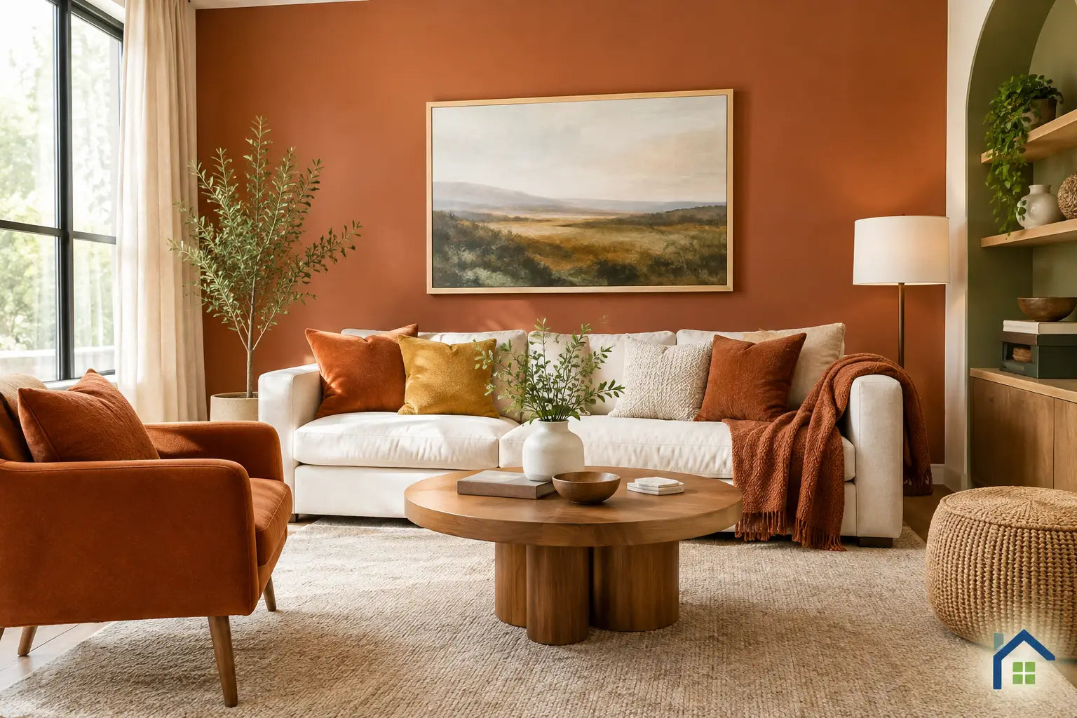
Earthy reds are becoming more refined and easier to use. Instead of a bright, saturated red, look for clay, muted terracotta, brick, rust, and cinnamon. These shades bring the comfort of a well-loved home and pair especially well with cream upholstery, walnut finishes, aged brass, and leafy greenery.
A clay-colored accent wall can give a large room an immediate focal point, but this family of colors works just as well in smaller doses. Try a rust-toned lumbar pillow, a terracotta vase, or a warm-hued candle arrangement on a coffee table. If your living room gets little natural light, use these tones as accents rather than painting every wall. They can make a dim space feel cozy, but too much saturation may make it feel enclosed.
Botanical greens with a relaxed edge
Green remains a favorite because it makes a living room feel settled and connected to the outdoors. For 2026, the strongest greens are softened by gray, brown, or yellow undertones: olive, moss, lichen, eucalyptus, and muted sage. They feel less formal than emerald and more enduring than a sharp, icy mint.
Olive is particularly useful for homeowners who want color without a dramatic statement. It has enough presence for cabinets, built-ins, or an accent wall, yet it behaves almost like a neutral when paired with warm wood and linen. A sage room can feel airy and gentle, while a deeper moss green adds a cocooning effect to a space used mostly at night.
Indoor greenery makes this palette even more convincing. Place a plant in a textured planter near a window, then echo its color with one or two soft furnishings. Repeating the shade lightly is more elegant than filling every surface with green.
Butter yellow and quiet golden tones
After years of muted interiors, gentle yellow is bringing optimism back into the living room. The key is choosing shades that feel creamy and mellow: butter, straw, soft marigold, or a faded golden beige. These colors catch daylight beautifully and add warmth to white, tan, and natural-wood spaces.
Butter yellow is especially appealing in rooms that feel a little too beige or gray. It introduces light without the high contrast of a bright primary color. Consider it on a small painted table, in a patterned throw, or through artwork with golden notes. A full yellow room can be charming, but it depends on the light and scale. In a compact space, a lighter buttery shade is usually easier to live with than a saturated gold.
Deep Accent Colors Create a More Collected Room
The softer side of the 2026 palette still leaves room for drama. Deep, enveloping accents are appearing in navy, ink blue, espresso brown, aubergine, charcoal, and near-black green. Used thoughtfully, these colors give a room definition and make lighter furnishings feel more intentional.
A deep blue chair beside warm ivory walls feels classic without feeling predictable. Espresso can add polish through a wood coffee table, picture frames, or a richly colored throw. Aubergine is a lovely choice for someone who wants a distinctive color that still feels mature and welcoming, especially when softened with blush, camel, or warm cream.
The trick is balance. Choose one deep color as the visual anchor, then surround it with lighter fabrics, natural texture, and a little reflective detail from glass, metal, or glazed ceramics. If you use dark paint on the walls, keep window treatments airy and make sure lamps create pools of warm light after sunset.
The new neutral is layered, not one-note
Neutral living rooms are not disappearing. They are simply becoming more dimensional. Instead of matching beige walls with beige furniture and beige rugs, combine related shades such as ivory, sand, oatmeal, mushroom, taupe, and cocoa. The room will still feel calm, but it will have enough contrast to feel designed.
Texture carries much of the color story here. Boucle, linen, woven cotton, brushed wood, ribbed glass, and ceramic finishes reveal subtle changes in tone as the light shifts. This is a smart approach for anyone furnishing a first home or building a room over time because each new piece has room to belong.
A personalized detail keeps this palette from feeling generic. A family-name sign, a meaningful framed coordinate piece, or a custom gift displayed on a console can bring warmth that no paint color can create on its own. At AllWayzHome, that mix of soft style and personal meaning is what turns a decorated room into a space that feels truly yours.
How to Choose a Trend Color You Will Still Love
Start with what cannot easily change. Look at your flooring, sofa, fireplace stone, wood tones, and the direction of your natural light. A north-facing room often benefits from cream, clay, and buttery tones, while a sun-filled room can handle cooler olive or deeper blue with ease.
Then decide what mood you want most. For a serene living room, layer warm whites with sage and soft wood. For a welcoming, conversation-ready room, use terracotta or cinnamon with caramel and cream. For a more elevated evening feel, add ink blue or espresso against lighter walls.
Before buying gallons of paint, test a large sample where you will actually see it - near windows, behind the sofa, and beside your existing textiles. Check it in morning light and after lamps are on. Color can look completely different across a single day, and the shade you love online may need a warmer or softer variation in your own home.
Bring the Palette Together With Meaningful Layers
The most memorable living rooms will not rely on a trend color alone. They will use color as a backdrop for the moments people want to create there: welcoming friends after a move, opening a thoughtful housewarming gift, sharing a quiet cup of coffee, or gathering family for a celebration.
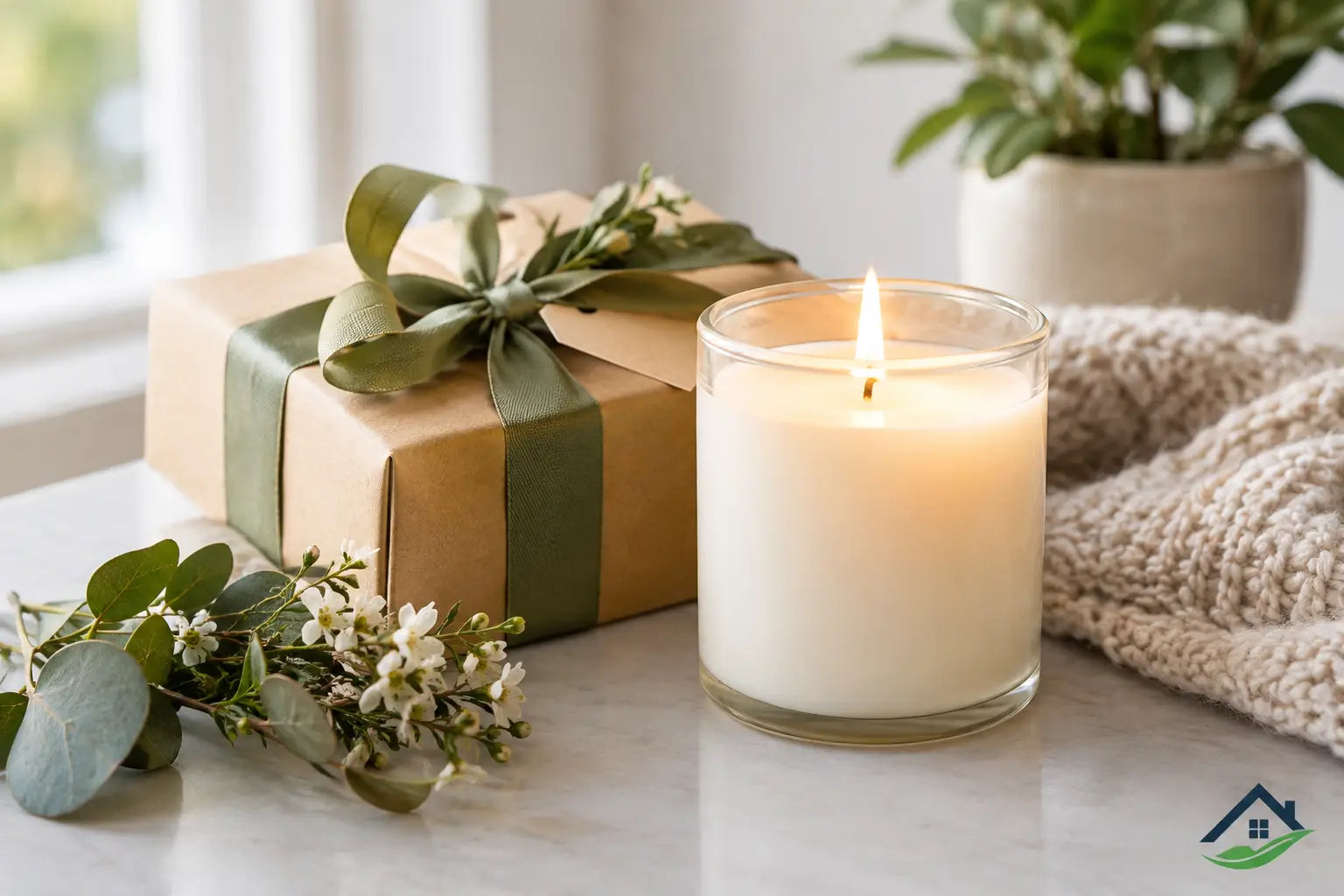
Choose the shade that makes you exhale when you walk through the door, then build around it slowly. A warm throw, a candle with a favorite scent, a planter with new growth, or a personalized piece on the shelf can be all it takes to make every corner feel more like home.